Typographic Jam Session

Typographic Jam Session

“Affamata di Sapere” – “Hungry to Know”. That seemed like a meaty phrase around which to create a letterpress printing project. It was last year, in conversation with a friend here, that I had first heard that phrase and it leapt back off the pages of my notebook just two days ago. I knew I wanted to integrate that into a piece.

Last year here in Italy, I traveled with an international group through the Legacy of Letters tour. Part of the program was the group collaboration on a large printed piece that was both poster and booklet. Our creation was rendered under the mastery and guidance of artist/letterpress printer, Lucio Passerini, while at the Tipoteca Italiana Fondazione. At the end of the tour, when farewells were being said, Lucio invited me to collaborate with him on a printed project the next time I was in Milano… which is now.

Two days ago I wrote to him with that phrase and a loose list of words swirling in my head… and no solid concept of the form it would all take. Lucio wrote back and said it would be a “typographic jam session” on-press. I liked that. We’d “wing it” and see where the words took us.

Our collaboration started at 3:00 yesterday with the consideration of the words… weighing, comparing their meanings, similarities and differences. We honed, each adding to and deleting from the list. Then we started brainstorming about design, form and fonts, many times finding that our ideas were mirrored by the other. Those were fun moments.

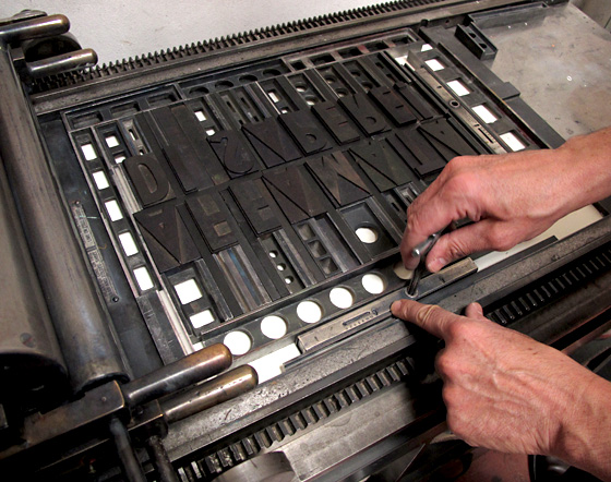
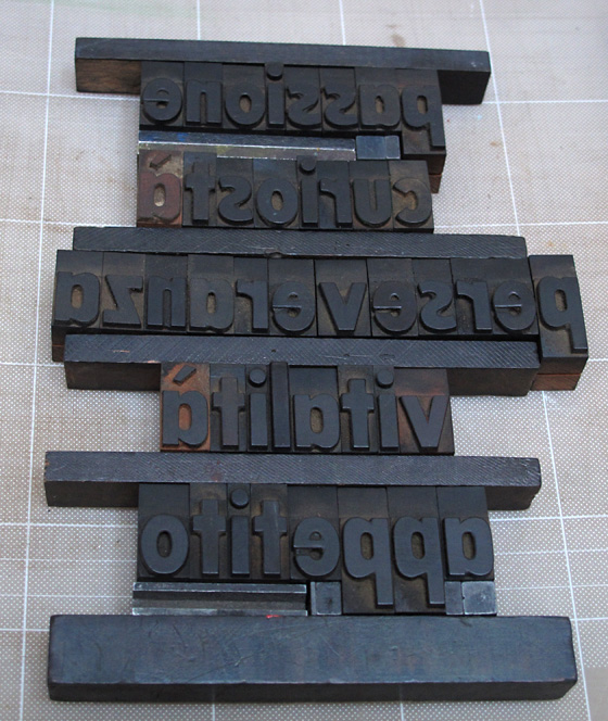
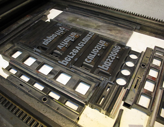
Letterpress printing boils down to each individual letter being put into place one-at-a-time. We were working with woodtype from the early 1900s, from Lucio’s collection. We composed the words, fussed with the spacing, then surrounded everything by a hundred various, mathematically-calculated pieces of metal until the whole thing created an entire rectangle. It was all then clamped rigid onto the press base, ready to be inked and printed. Lucio’s been doing this for so many years and I enjoyed watching his process, seeing his thoughts made visible as he worked.

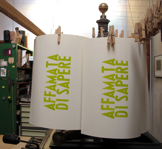
We printed for 5 hours, adjusting layout and color on-the-fly. “A touch of red” in the green. “A little taste” of white and blue in the dark gray, aiming for more sophisticated color admixtures. The spring green came off the press first, hung to begin drying, then we printed the word list in its dark gray.

Look at all of the individual pieces to create those three words. And many are so small you can’t see them here.

Lucio-Affamata-Setup-1

Lucio-Affamata-Inking-Up

I hung up the printed proofs then we stood across the room to judge the letterspacing and then make adjustments by adding and removing pieces of wood and metal between each letter. (Our green ink started out much too “lime” for my taste so we made it more of my favorite spring, wasabi green.)

Lucio-Affamata-Hanging-Proof

Forty printed sheets were hung from a rack suspended from the ceiling, waiting for the second impression.

Lucio-Affamata-Hanging-to-Dry

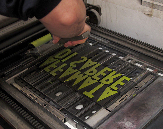
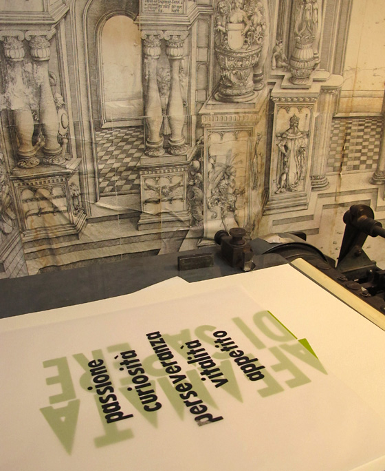
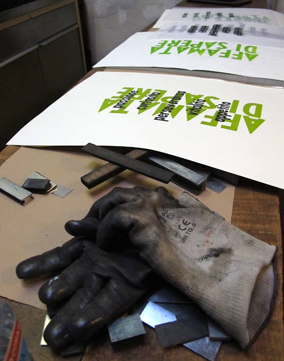
Sometimes typos hide when reading things backwards. Do you see the error in the following photo?

Lucio-Affamata-Le-Parole

Lucio-Affamata-Inked-Up-Words

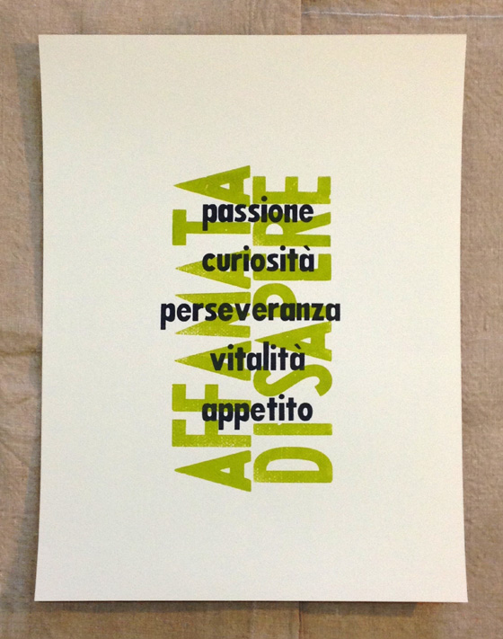
We printed a tissue paper proof to determine the best position of the word list, overlaying the “affamata” phrase.

Lucio-Affamata-Le-Parole-Proof

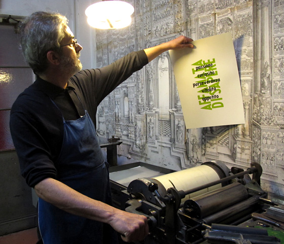
We both smiled when the first, final piece came off the press.

Lucio-Affamata-First-Full-Proof

Lucio-Affamata-Proofs-Gloves

“Hungry to Know. Passion, curiosity, perseverance, vitality, appetite.”

Lucio-Affamata-Final-Piece

When we finished, we joined Lucio’s dear wife at their home, for a celebratory toast, appetizers and a chat. It was a very good day. Grazie, Lucio!

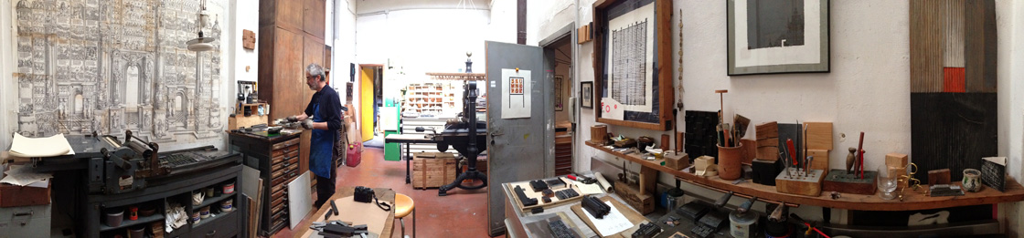
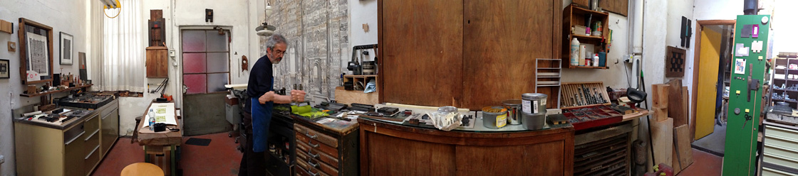
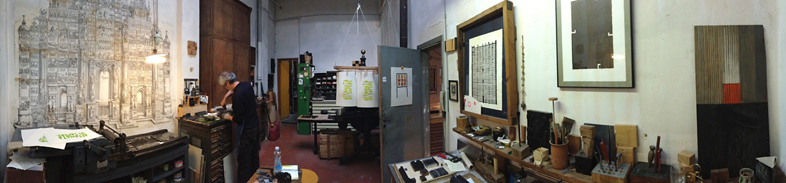
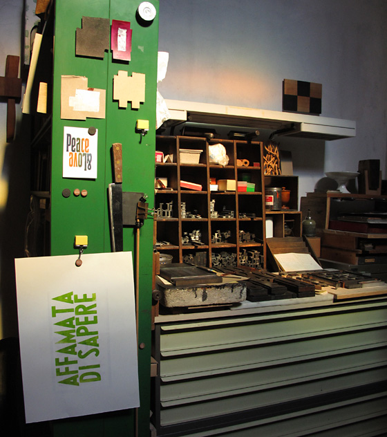
Here are shots of part of Lucio’s studio/print shop. Note how the light changed between 3:00 and 8:00 p.m. (Click on each one to enlarge the photo.)

Lucio-Affamata-Pano-1

Lucio-Affamata-Pano-2

Lucio-Affamata-Pano-3


Zucchi Collection

Zucchi Collection

When here in Milano in the summer of 2008, I stumbled upon a Zucchi Store just a half block north of the Duomo. They sell lovely household linens (sheets and towels) and they had a curious display in the window. I didn’t understand what I was seeing, so I had to go in.

Emerging up through a very large, circular hole in the first floor was a towering stack of flat wooden blocks. What were the blocks? It was then that I found out about the Zucchi Collection of wood-and-pewter blocks for printing fabric.

From the Zucchi Website: “The Collection’s 12,000 designs bear witness, over a period which spans three centuries from 1785 to 1935, to a fashion that was both varied and popular. Such tastes were apparent during one of the most energetic and fertile periods of European culture, which ended with the first stylistic experiments of the Art Nouveau and Art Deco movements.

“The Collection houses 56,000 printing blocks, an extraordinary number by any reckoning and one which presents concrete problems not only of space but also of storage in structures able to support the weight of many tonnes. The Collection is housed in three different storage locations: the Zucchi office in Casorezzo, the Via Foscolo location in Milan and a warehouse in Ossona.

“To make the Collection accessible not only to scholars but also to the fashion people, it was necessary to choose criteria by which the artefacts could be subdivided. The Zucchi Collection has been divided into six categories, which are identified in terms of iconographic forms: abstract, cashmere, floral, geometric, ornamental and pictorial. The Collection has been further subdivided according to the specific uses not only for the borders of the materials but also for foulards, bandanas, various ties, scarves and cravats, etc. A special data card, in computerised and paper formats, has been assigned to every series of blocks. Each of these contains various items of information about the handblock concerned, including the number of pieces which make up the structure, the design style it is capable of reproducing, its historical period and its origins. Attention has also been given to the question of conserving these structures and rightly so because the wood is sensitive material. The humidity and temperature levels require strict control and beeswax and turpentine must be applied to maintain the elasticity of the wood.”

A mere fraction of the collection has been on display on the lower floor of the Zucchi Store, including floor-to-ceiling, wall-to-wall shelves holding the numbered wood blocks. (They are now in the process of moving these blocks to another location.) Note that some designs have 3-5 different blocks to create the full design. (They are all numbered alike.) Being a lover of textiles I was immediately enamored of the collection.

Fast-forward almost 2 years and now I’m living in Milano. Last Fall I found a curious and creative textile studio not far away named “L’Hub” on the Naviglio Grande, the “big” canal. One, they were selling vintage Zucchi linen and cotton dishtowels from the mid- and late-1900s. (Yes. I bought a bunch.) Two, they offer all sorts of creative textile classes including dyeing, sewing, construction, AND printing fabric with the centuries-old Zucchi blocks! Can you say “Sign me up!”?

I enrolled in the 3-hour class held last Saturday afternoon, taught by artist Franco Duranti (at the very far left in the next photo). Among other things, Franco is a painter, engraver, and video artist AND since 2007, he’s been creating original works with the Zucchi wood blocks! Below is a photo of the working studio at L’Hub. Some women were taking a sewing class, while two other women were also taking the fabric stamping class.

I wanted “classic”. I had just seen the Frette Textile Exhibit a week ago. I’m enthralled by the traditional fabric handwork of generations past and am especially inspired by my Great Great Grandmother’s work, done at age 12 in 1861. She crafted a cross-stitch sampler in “Turkey Red” on cream-colored cloth, and that color combination has launched me ever since my Grandmother gave me the sampler in 1975.

On the neighboring streets (on that recent day when I was getting snowflakes in my eyes) I scouted fabric stores and came away with Italian, 100% Linen. I bought a meter of fabric and took it home to prewash.

In familiarizing myself with the printing process, I chose a simple fleur-de-lis pattern printed in “carminio” – carmine red – on the linen. Note how, in this case, the block carries an “island” of cast pewter attached to the wood,

The following is an intricate, cast-pewter, paisley design from the “Cashmere” group of blocks in the collection. THIS makes my heart melt! Unfortunately, I was not able to print with this block, but printed with one I found that was as close as possible.

In gathering fabric for printing, I had also gone BACK to the Zucchi store downtown and they just happened to be having a sale! I bought two sets of sheets. One set is 100% cotton, satin finish with a subtle, printed khaki/cream pattern. I printed right over the top of the pattern to create a set of sheets like no other in the world.

I also paid a visit to the second-hand store 2 blocks away. I found white, cotton button-end pillowcases and bought all six at 2 euro each (about $2.75) When I got them home to wash them, I looked inside and noticed a… Zucchi label! Of course.

My plan now is to return to the L’Hub studio for a solo 3-hour stint to embellish the pieces I began, and to print even more.

As I wallow in Art and Design during my time here in Italy, I can’t imagine a more exhilarating addition to my list of design experiences than printing with the Zucchi handblocks at L’Hub!