Hope Maltz:
Moving into Comfort
Client Description:
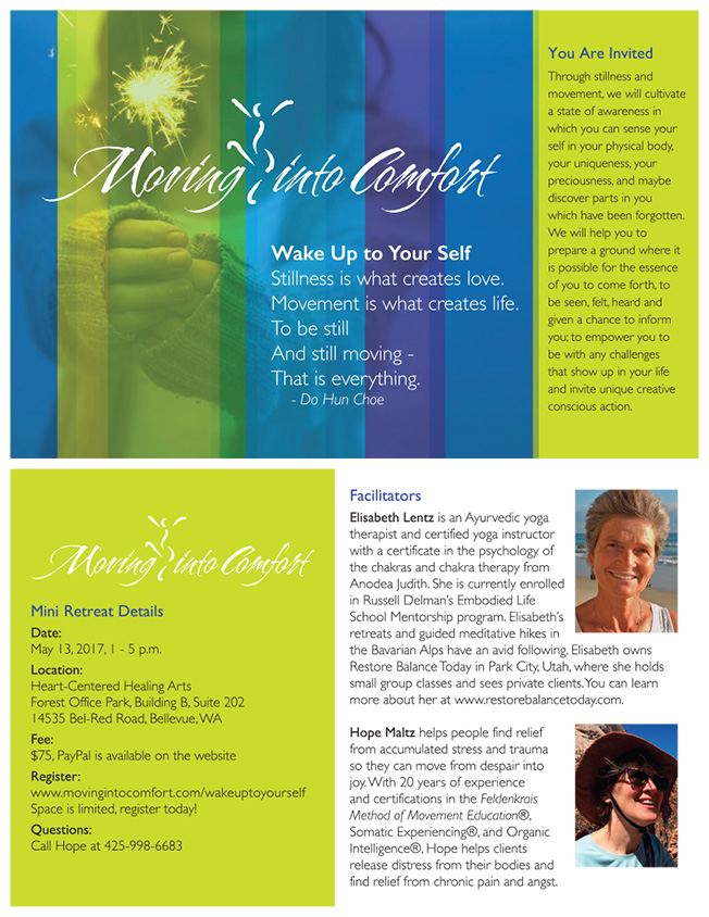
Client Hope Maltz had an existing logo that needed to be “freshened up” from it’s gray and dark blue… and its form needed refinement. She wanted to communicate more brightness and optimism for her clients that are facing chronic pain and trauma.
Through collaboration, Hope and I created a system and flavor of overlaying color and photos, fitting within the new Graphic Standards, and allowing her to add her own web content.
Services to Client:
- Rebranding
- Design of promotional materials
- Graphic Standards guidelines
- Web site consultation

Maltz – Moving into Comfort Logo
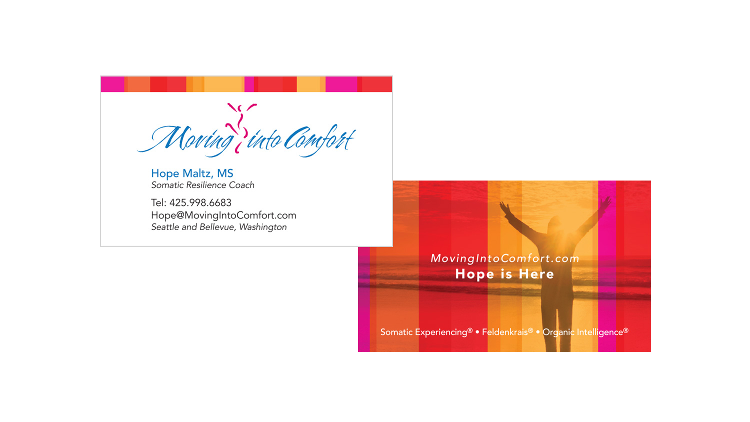
Maltz – Business Card Front & Back

Maltz – Blue Green Photo Banner