by Maureen | Jun 13, 2010 | Bologna, Church, Food!, Graphics, Incredible Locations, Introspection, Journal, Photos, Quips, Shopping & Markets
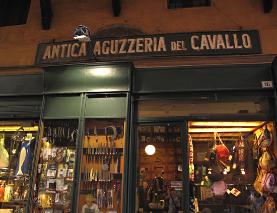
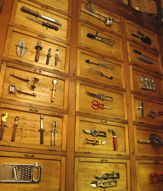
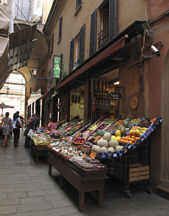
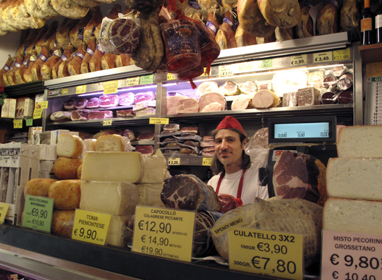
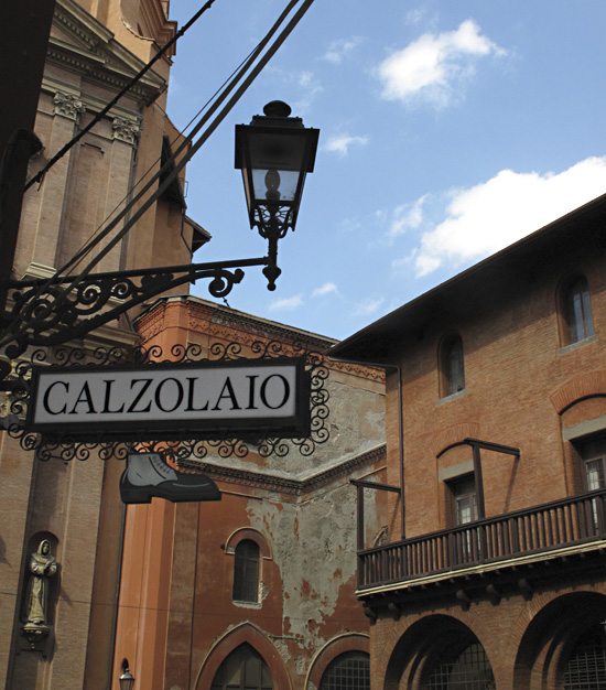
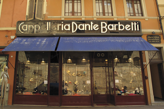
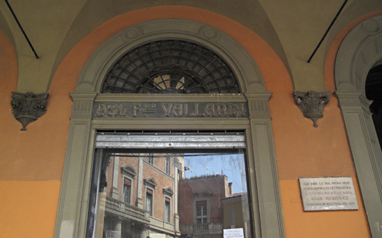
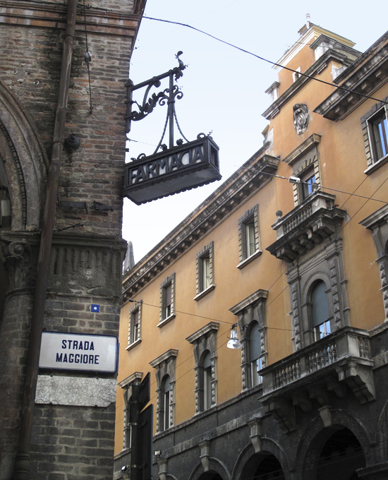
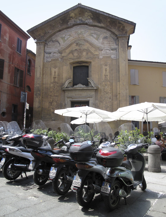
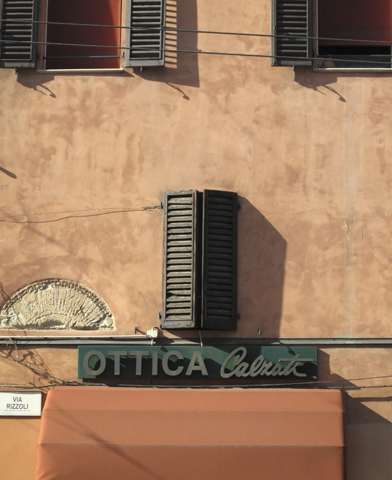
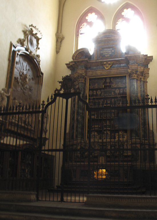
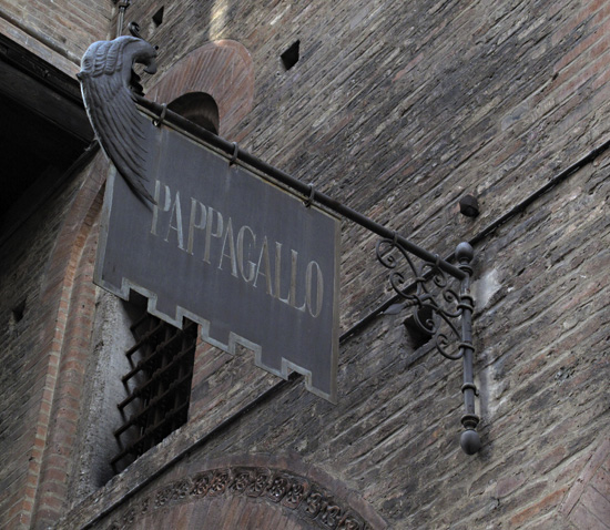
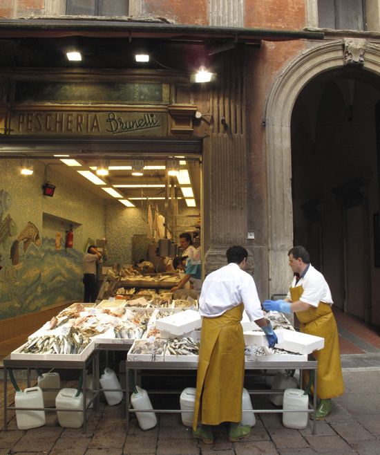
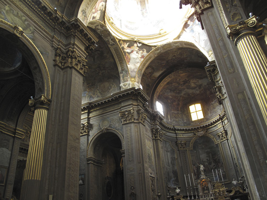
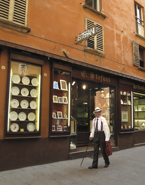
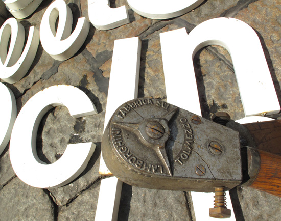
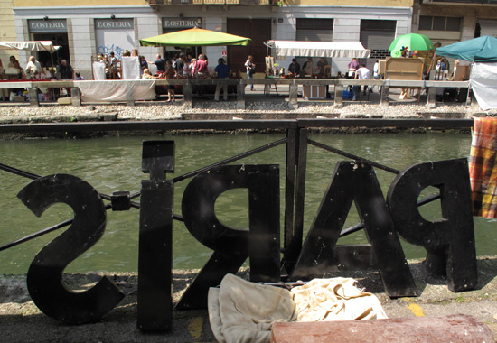
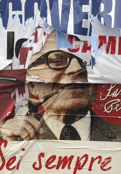
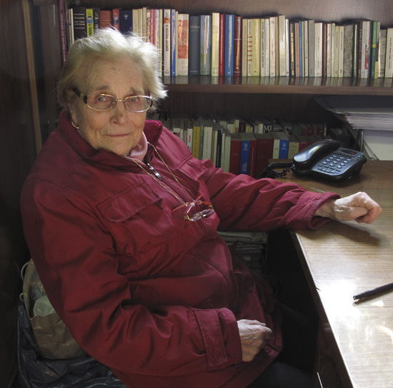
The visual lushness in Italy thrills me. Architectural details. Signage. The artistic sense. And the character of the people. As an artist, I am fed deeply as I explore this country. I expect that the inspiration and imagery I’ve found here will propel me for years to come.

.

.

.

.

.

.

.

.

.

.

.

.

.

.

.


by Maureen | May 30, 2010 | Canals, Discoveries, Journal, Photo of the Day, Photos, Shopping & Markets
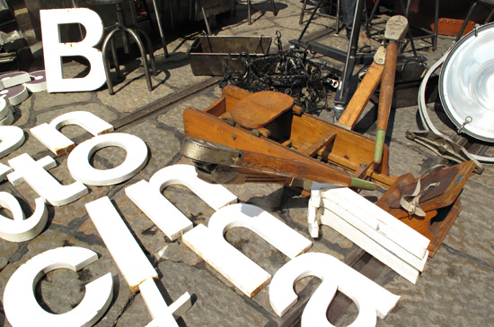
Another day at the Antiques Market along the Naviglio Grande. Summer is in full swing and tourists have found this hot spot. It’s “the” place to be on the last Sunday of the month for anyone wanting a very diverse selection of some pretty choice items. “Antique” in Italy covers a broader range than “antique” in the U.S.!
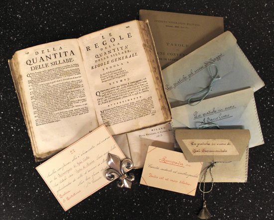
The sellers know full well what they’ve got and the high demand for what they’re offering and they’re not giving any of it away for cheap! Sometimes I wonder what I’m doing there. I have no budget for this stuff! But I remind myself that there’s value in simply SEEING it. Tools and instruments. A world atlas from the 1700s. Household goods and fixtures. Old nuns’ handwritten devotional cards in hand-stitched envelopes. Embroidered linens. Letterpress printed prayerbooks of handmade paper bound in hide. Maps and etchings of former cityscapes. The historical reference alone makes it worth spending a day gently handling 300-year-old book pages.

I find the very old and the very curious. (A Lamborghini wooden rowing machine?!) I look around for hours until I’m mentally saturated and physically hungry, unable to really appreciate any more. By then I’m going home with a few little trinkets that are affordable and packable, and a mind full of imagery I hope to never forget.

.

.

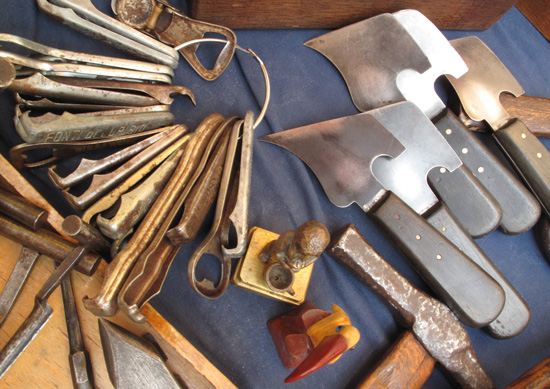
At right (below) are leather-working knives.

by Maureen | Apr 10, 2010 | Introspection, Journal
Journal Entry – 10 Aprile 2010
Really, I’ve kept my world very small. There are some that would rush to assure me otherwise, but when I honestly scan the content and structure of my life, my relationships are one-on-one and my focus is on small details. I’m not a “Grand, Big Picture” thinker.
I think I have good design thinking. And yet here I am in Milano, a world capital of design, and I have not set foot into it. I have not immersed myself by meeting who’s who and participating in local projects. I haven’t consumed the buzz of either design refinement or innovation, though opportunities overflow the city.
What have thrilled me most while here have been the fleeting encounters with people along the way: Mary at the Cemetery with her traditional handwriting; Angelo giving me a history lesson as we rode bikes through the farmland; elderly Signor Conforti in his bookshop in Florence and his handshake goodbye; the old woman in fleece pants on New Year’s Day that chatted with me about handkerchiefs and big buttons. These little meetings have been many and they’ve always left me beaming for the day.
Very informally I have been an observer and recorder of the visual lushness around me, whether it’s architecture and sculpture, garbage cans and curb cuts, or simply odd juxtapositions that tease my eye.
All of this is very telling about my priorities, desires, strengths, values and direction. Though I believe very deeply in the power of design to change the world, and though design absolutely permeates my day and my thinking, my greater joy is in personally touching one life at a time, in the smallest ways. Reality is, design fills and textures my life, but is not the focus of my life’s efforts.
I’m a “good” designer, not a “great” designer. I am unknown in the design world, amongst other designers. (Which is fine with me.) Have I “wasted” my talent? Design gives me a good living and I have assisted many clients with their goals. Is that sufficient?
– – – – –
(All of these musings help to form a plan for my direction during the remainder of my time here and once I return to the U.S. I’ve certainly had a lot of time to think!)

by Maureen | Apr 2, 2010 | Discoveries, Featured Articles, Graffiti & Street Art, Graphics, Journal, People, Photo of the Day, Photos
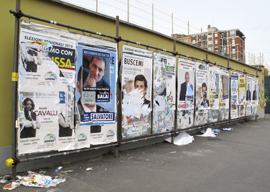
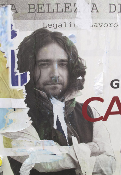
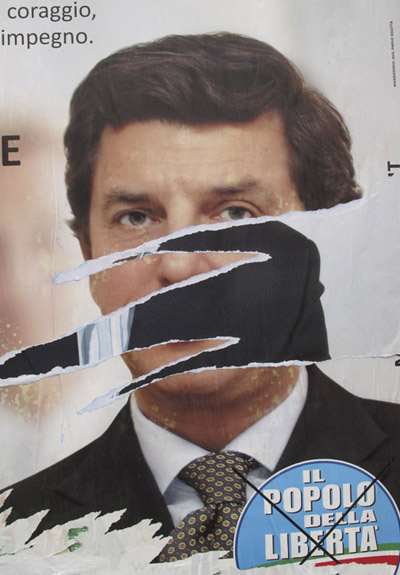
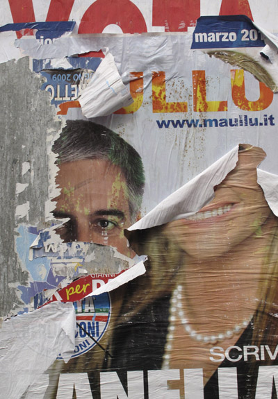
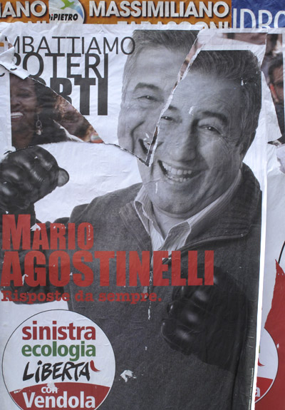
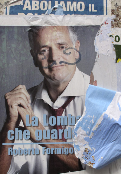
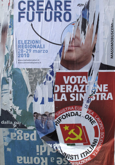
They put the temporary, scaffold-and-tin poster walls back up in my neighborhood just in time to feature advertising for the regional elections. Three inch holes are bored into the sidewalk, with rubber plugs for the off-season. Overnight, they can pop the plugs and throw up the walls clean and ready to be weighted with soon-flaking layers of advertising.


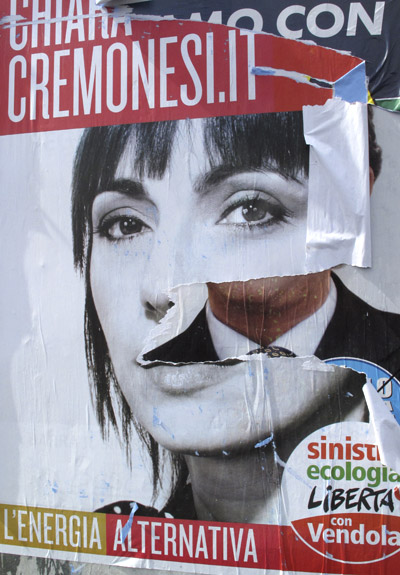
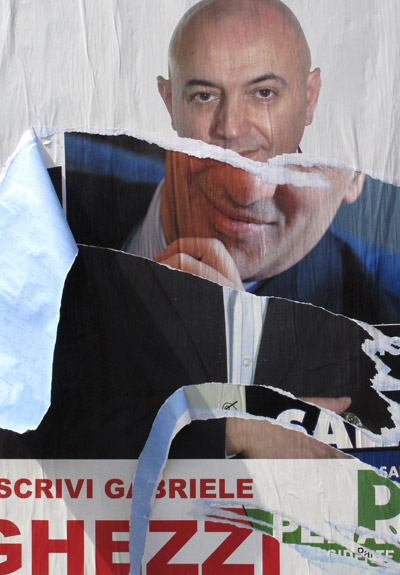
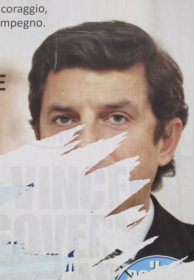
The other day, I was amused that as time, rains and passersby have swept past, the portraits on the political posters have been “enhanced”.
Isn’t this one “Art with a capital A”, all on its own!? It’s my favorite.

.

.

Somehow, “bellezza” – beauty – seems an appropriate headline for this dandy.

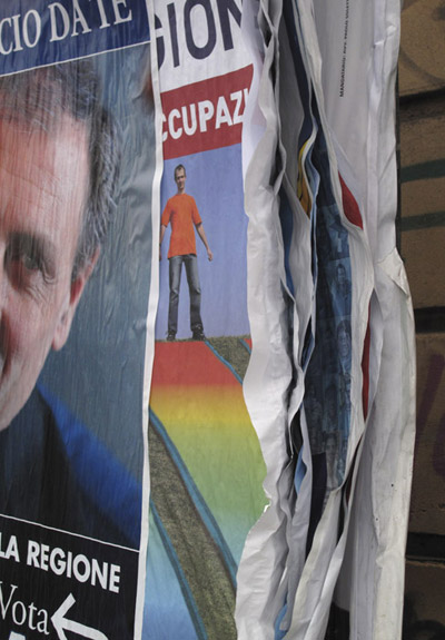
And, side-by-side, this man was fortunate to have two renditions of his portrait.

The word showing through the peeled section below – “vincere” – means “to win”. Hmm. Subtle.

.

.

.

.


by Maureen | Mar 18, 2010 | Discoveries, Featured Articles, Journal, People, Photos
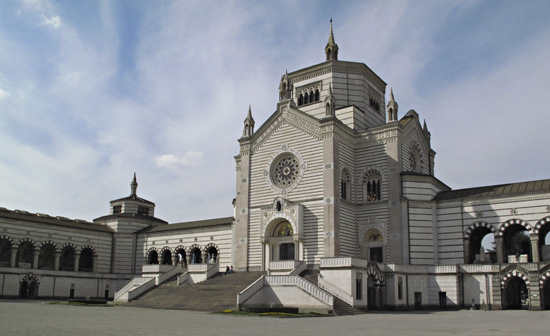
Last June, just a few days after I had arrived here in Milano, I went to the Cimitero Monumentale – the Monumental Cemetery – to look around. It is, indeed, “monumental” and every bit worth an afternoon of strolling and looking. As they say, it is WAY over the top! One can study architecture, sculpture, typography and history. The structural monuments are bigger than my apartment and of every possible architectural style. Every family grave plot features a noteworthy sculpture. That cemetery provides a very concentrated study location, like none other I know.

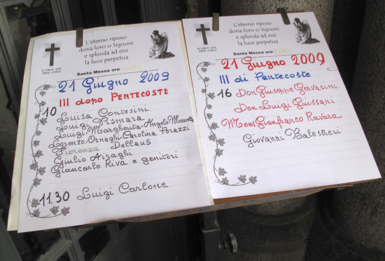
So, back to Mary. In June, after being awestruck by the cemetery grounds themselves and feeling saturated by it all, I started toward the exit, through the main “gallery” building. I heard chanting and the monotone of prayer, and it changed my course. Around back and in the lower level is a small chapel. I approached the doorway and simply stood outside, listening to the rhythm of women saying the rosary. At the doorway was a simple stand with a listing of the names of the recently deceased, for whom the women were praying.

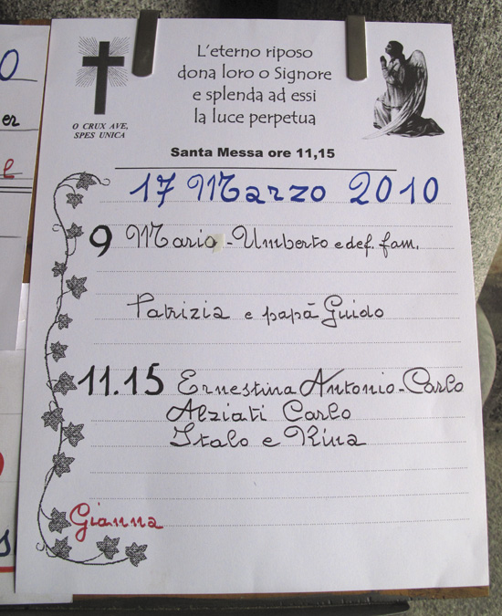
The handwriting stopped me! SO unlike what we learned long ago in school in the U.S. So European. So distinctive!
Lately, as I have continued to intensively “mine” Milano for design references, that very particular handwriting has pulled at me. I went back to the cemetery on Monday, to shoot the day’s page of names, however, the cemetery was closed. I went back again today and made a bee-line for the chapel front. Yes! There it was. That lovely, lyrical, not-quite-cursive pen! I photographed each of the 3 sheets posted there, then turned north for a tour of the cemetery.

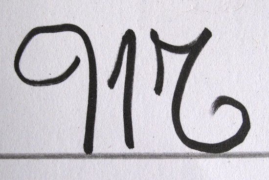
Mary’s capital letter “M”:

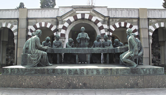
During my slow amble, one of the cemetery workers approached me and asked if I wanted to see the Campari tomb. (This cemetery holds the remains of all the “big-name families” of Milano: Campari – the drink, Ferrari, Pirelli, Zucchi and many others. The sources of all the street names in town!) Of course I said yes, and he, Salvatore, took me to the northwest area of the grounds and to the grand tomb capped by a sculptural “Last Supper”. At it’s backside was an open vault with a beautiful mosaic covering walls and ceiling.

While Salvatore and I chatted, I showed him the pictures I had shot of the wonderful handwriting. I asked if he knew who had done it and said that I would like to meet her. (It speaks of femininity, so I assumed it was a woman.) I didn’t understand everything he said, but it was something about 3 o’clock and come back another time. (It was then about 1:30.) I thanked him for his help, said goodbye and kept looking around.
Time flies in that incredible cemetery. It would be hard to tire of that place, impossible to cease seeing something new. I saw Salvatore again and it was after 3:00. He suggested that I might be able to meet the person that wrote the pages, so he took me to the brown-cloaked priest and I explained who I was looking for. Father signaled for me to follow him, and we wrapped through the crypt-filled hallways to a nondescript door which led into the back of the chapel. He took me through a few interior halls to a room with a western window and the afternoon light… and Mary.

I told her how beautiful her handwriting is and that I couldn’t stop thinking about it lately. It’s the most beautiful and distinctive I’ve seen here. Using all the “polite” Italian I could remember, I asked her if she would kindly write out an alphabet and number set for me, with upper and lower case letters. She seemed tickled and agreed, but asked if I would come back another day to pick it up. She wanted time to do it well.
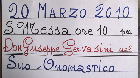
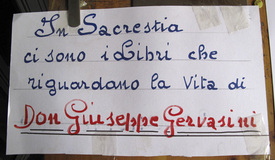
Part of today’s list of names speaks of Don Giuseppe Gervasini, a priest that lived from 1867 to 1941 and is believed to have special healing powers. Mary – pronounced more like “Mah-ree” with a light trill to the “r” – carefully shuffled some papers in a deep drawer in her office and removed a wallet-sized photo of Father Gervasini. She gave it to me and instructed me to keep it with me always, saying that Don Gervasini would keep me protected. (A mass is being held in the chapel this Saturday at 10:00 in honor of Don Giuseppe Gervasini’s “name day” – onomastico. I guess I know what I’m doing Saturday morning.)


“Mary, Salvatore told me that you’re 84 years old.” “Yes. How old are YOU?” When I answered, she said, “I thought you were 30! You look like it!” I told her she’s sweet for saying so. She gave me a kiss on each cheek goodbye and I told her I’d be back tomorrow to come pick up the alphabet. (I’ll take her some flowers and some greeting cards that I made, as a little “thank you”.)
I absolutely beamed all afternoon as I left the cemetery! To have not only seen more of the handwriting I enjoyed so much, but to MEET the woman that does it, AND to have her agree to write out a full alphabet for me, AND to have her be so sweet to chat with… And I have such fondness for elder women. It is exactly these unexpected, unplanned, never-to-be-imagined meetings that charm my time here in Milano.

by Maureen | Mar 17, 2010 | Discoveries, Featured Articles, Graphics, Journal, Photo of the Day, Photos
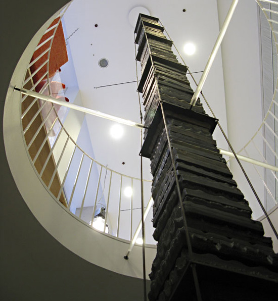
When here in Milano in the summer of 2008, I stumbled upon a Zucchi Store just a half block north of the Duomo. They sell lovely household linens (sheets and towels) and they had a curious display in the window. I didn’t understand what I was seeing, so I had to go in.
Emerging up through a very large, circular hole in the first floor was a towering stack of flat wooden blocks. What were the blocks? It was then that I found out about the Zucchi Collection of wood-and-pewter blocks for printing fabric.

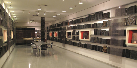
From the Zucchi Website: “The Collection’s 12,000 designs bear witness, over a period which spans three centuries from 1785 to 1935, to a fashion that was both varied and popular. Such tastes were apparent during one of the most energetic and fertile periods of European culture, which ended with the first stylistic experiments of the Art Nouveau and Art Deco movements.
“The Collection houses 56,000 printing blocks, an extraordinary number by any reckoning and one which presents concrete problems not only of space but also of storage in structures able to support the weight of many tonnes. The Collection is housed in three different storage locations: the Zucchi office in Casorezzo, the Via Foscolo location in Milan and a warehouse in Ossona.
“To make the Collection accessible not only to scholars but also to the fashion people, it was necessary to choose criteria by which the artefacts could be subdivided. The Zucchi Collection has been divided into six categories, which are identified in terms of iconographic forms: abstract, cashmere, floral, geometric, ornamental and pictorial. The Collection has been further subdivided according to the specific uses not only for the borders of the materials but also for foulards, bandanas, various ties, scarves and cravats, etc. A special data card, in computerised and paper formats, has been assigned to every series of blocks. Each of these contains various items of information about the handblock concerned, including the number of pieces which make up the structure, the design style it is capable of reproducing, its historical period and its origins. Attention has also been given to the question of conserving these structures and rightly so because the wood is sensitive material. The humidity and temperature levels require strict control and beeswax and turpentine must be applied to maintain the elasticity of the wood.”
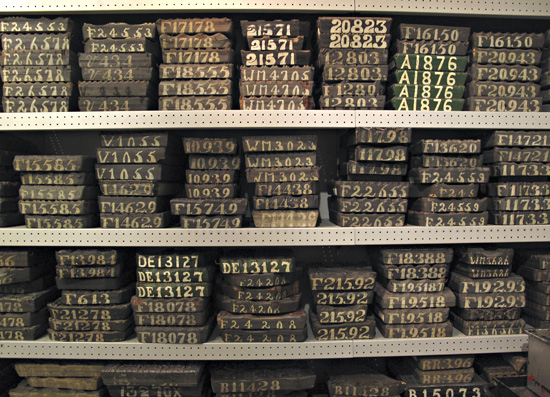
A mere fraction of the collection has been on display on the lower floor of the Zucchi Store, including floor-to-ceiling, wall-to-wall shelves holding the numbered wood blocks. (They are now in the process of moving these blocks to another location.) Note that some designs have 3-5 different blocks to create the full design. (They are all numbered alike.) Being a lover of textiles I was immediately enamored of the collection.


Fast-forward almost 2 years and now I’m living in Milano. Last Fall I found a curious and creative textile studio not far away named “L’Hub” on the Naviglio Grande, the “big” canal. One, they were selling vintage Zucchi linen and cotton dishtowels from the mid- and late-1900s. (Yes. I bought a bunch.) Two, they offer all sorts of creative textile classes including dyeing, sewing, construction, AND printing fabric with the centuries-old Zucchi blocks! Can you say “Sign me up!”?
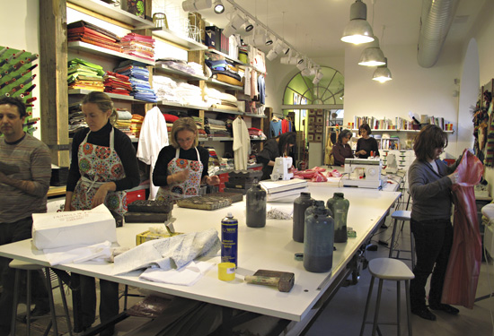
I enrolled in the 3-hour class held last Saturday afternoon, taught by artist Franco Duranti (at the very far left in the next photo). Among other things, Franco is a painter, engraver, and video artist AND since 2007, he’s been creating original works with the Zucchi wood blocks! Below is a photo of the working studio at L’Hub. Some women were taking a sewing class, while two other women were also taking the fabric stamping class.

I wanted “classic”. I had just seen the Frette Textile Exhibit a week ago. I’m enthralled by the traditional fabric handwork of generations past and am especially inspired by my Great Great Grandmother’s work, done at age 12 in 1861. She crafted a cross-stitch sampler in “Turkey Red” on cream-colored cloth, and that color combination has launched me ever since my Grandmother gave me the sampler in 1975.
On the neighboring streets (on that recent day when I was getting snowflakes in my eyes) I scouted fabric stores and came away with Italian, 100% Linen. I bought a meter of fabric and took it home to prewash.
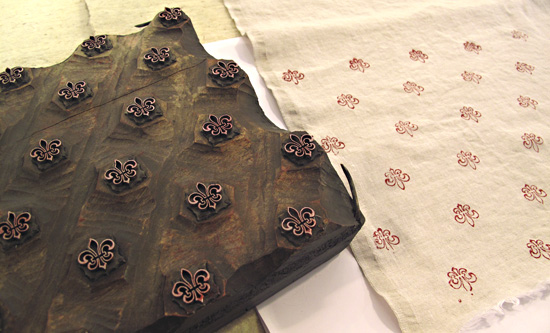
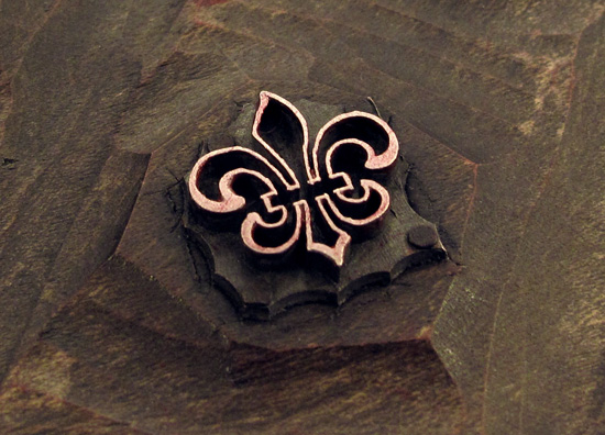
In familiarizing myself with the printing process, I chose a simple fleur-de-lis pattern printed in “carminio” – carmine red – on the linen. Note how, in this case, the block carries an “island” of cast pewter attached to the wood,


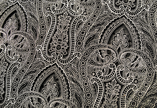
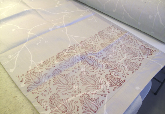
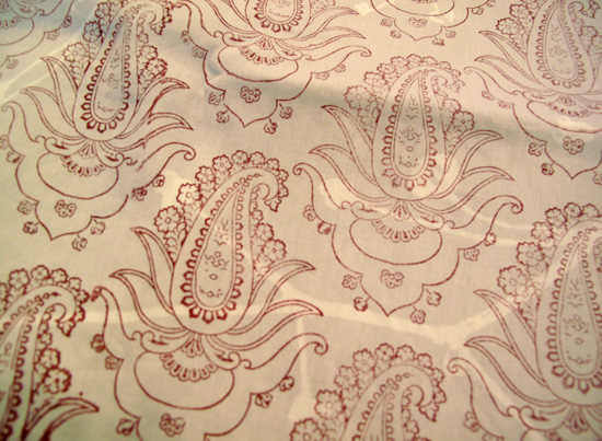
The following is an intricate, cast-pewter, paisley design from the “Cashmere” group of blocks in the collection. THIS makes my heart melt! Unfortunately, I was not able to print with this block, but printed with one I found that was as close as possible.

In gathering fabric for printing, I had also gone BACK to the Zucchi store downtown and they just happened to be having a sale! I bought two sets of sheets. One set is 100% cotton, satin finish with a subtle, printed khaki/cream pattern. I printed right over the top of the pattern to create a set of sheets like no other in the world.
I also paid a visit to the second-hand store 2 blocks away. I found white, cotton button-end pillowcases and bought all six at 2 euro each (about $2.75) When I got them home to wash them, I looked inside and noticed a… Zucchi label! Of course.
My plan now is to return to the L’Hub studio for a solo 3-hour stint to embellish the pieces I began, and to print even more.
As I wallow in Art and Design during my time here in Italy, I can’t imagine a more exhilarating addition to my list of design experiences than printing with the Zucchi handblocks at L’Hub!


by Maureen | Mar 15, 2010 | Discoveries, Featured Articles, Journal, Photo of the Day, Photos
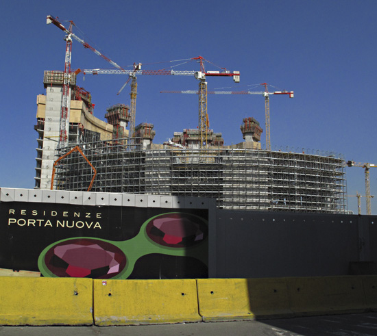
JUST as they were on a crane removing this billboard ad for high-fashion lingerie, I was walking by with my camera and had mere moments to shoot. What will they put up next to keep the construction workers inspired?
This is a large, new complex being built at the north edge of town, right around the Garibaldi metro stop.


by Maureen | Mar 14, 2010 | Featured Articles, Food!, Graphics, Journal, Photo of the Day, Photos, Shopping & Markets
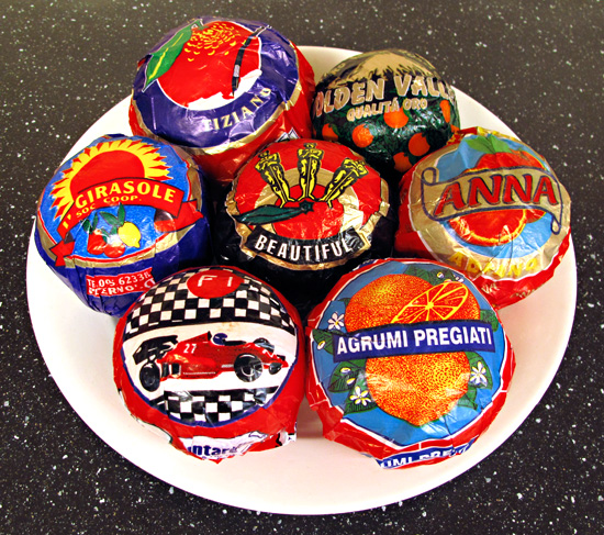
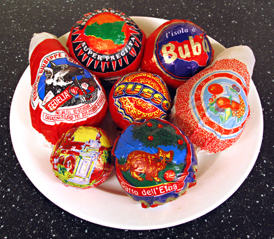
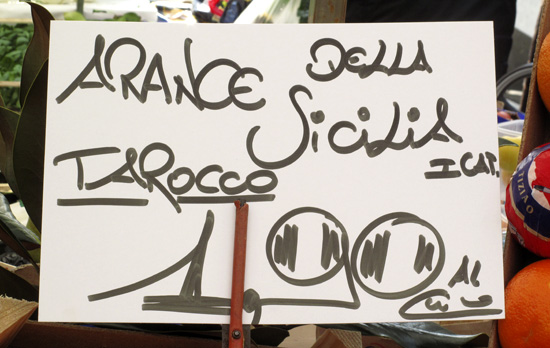
Yesterday morning I went to the local Saturday market on a mission: gather as many different citrus tissue wrappers as I could find. From each stall that had some of the paper-wrapped fruit, I bought two oranges, and mandarins if they were also wrapped. After cruising the whole market, I ended up toting home a lifetime’s supply of oranges, two heavy bags of citrus, plus a few wrapped pears.
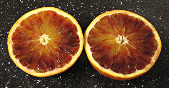
At this time of year, most of the oranges seem to be the “Arance Tarocco“, the blood orange. Some I’ve purchased have been a very deep purple in color, fading to a classic, clear orange hue. Gorgeous, tasty, sweet.
The papers are such a study in design and imagery. I think my favorite is the Formula 1 Ferrari race car with the quintessential black and white checkerboard pattern. (What does any of that have to do with oranges?)


by Maureen | Mar 12, 2010 | Discoveries, Featured Articles, Journal, Photo of the Day, Photos
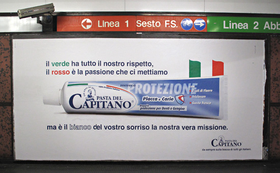
Milano is a fabulous place to do a “design intensive” exploration, and I’ve stepped up my voracious visual consumption of the rich details around me. What a place to study typography, graphics, signage and advertising! Everything captures my mind.
Even a toothpaste ad.

“The green has all our respect, the red is the passion we put into it,
but it’s the white of your smile that’s our true mission.”
No, not all Italian packaging has such a retro, stereotype look. One finds the usual Crest, Colgate and Sensodyne on the grocery shelves, but with Italian swapped for English. That must be why “Pasta del Capitano” seemed like such a throwback, and stopped me while rushing for the subway car.

by Maureen | Mar 8, 2010 | Discoveries, Featured Articles, Graphics, Journal, Photos
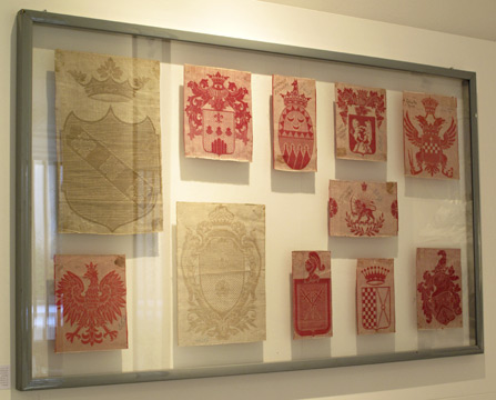
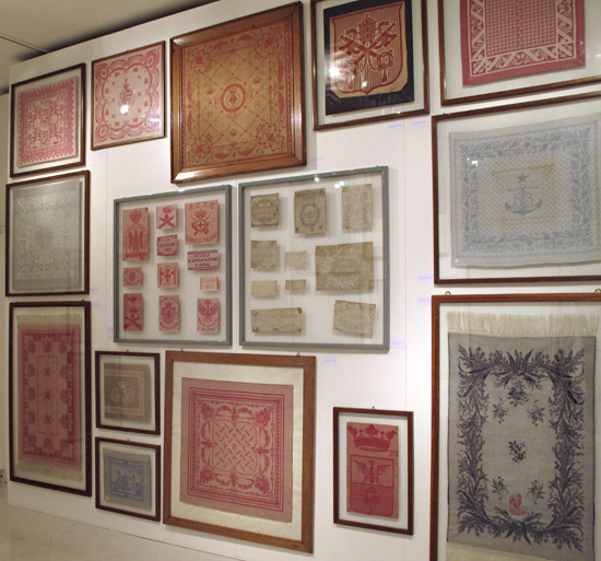
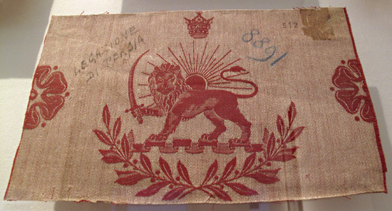
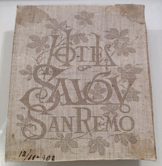
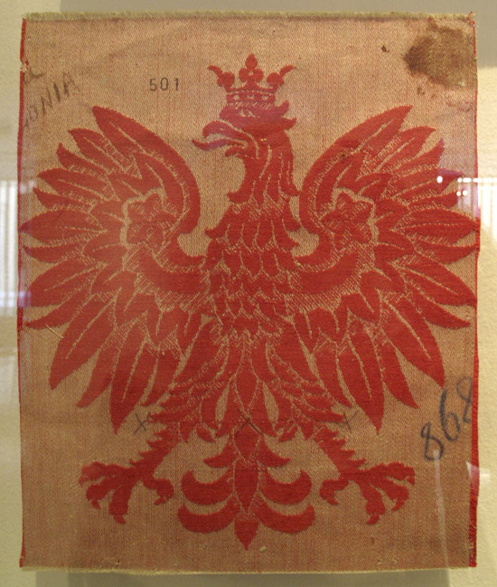
When I rounded the corner and saw the wall of red and cream damask patterns, I skipped both a breath and a heart beat. These are the textiles I came for. These are the fabrics I prowl and lurk for at the antique fairs.
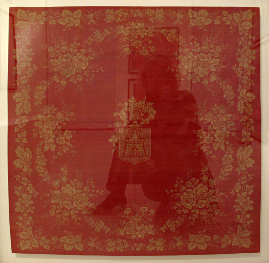
“The Thread of Dreams – Il Filo dei Sogni” is a show at the Palazzo Morando Costume Moda Immagine here in Milano. The show marks the 150 years of the Frette Linens company, 1860-2010. Absolutely gorgeous damask/jacquard patterns from the time of Frette’s beginning were gathered on a heart-stopping wall. I swooned. And then turned and strolled to look at them all.
Having been a seamstress for as long as I can remember, my heart rate really does pick up a few beats when in the presence of beautiful fabric. And, owning a red-on-cream embroidered piece from my great, great grandmother that she stitched at age 12 in 1861, I have a tremendous soft spot for that color combination. Combine those two joys and of course it was dreamlike for me to see this show!

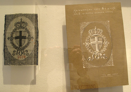
Original hand-painted and hand-drawn designs were shown side-by-side with the final woven fabric. A pleasure to see “the hand” of the designer. (And impossible to avoid glare and reflection in the exhibit space!)


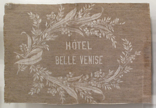
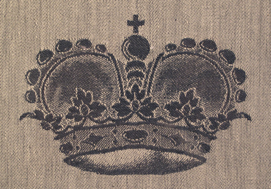
They showed overall patterns, borders, coats-of-arms, hotel emblems, nautical, floral and heraldic designs. If I were to bring home any “souvenir” from Italy, I would love to get my hands on one of these Frette fabrics, either vintage or modern day!


Why fight the reflection? Here’s a Frette self-portrait. (My sister is always saying “I want to see pictures of YOU over there,” so this is my way of complying with her request.)

Currently, Frette is known for their very sumptuous bed linens. Ooo lah lah. A damask top sheet alone can be $250 or more and the fabric is supple and luxurious to the touch.

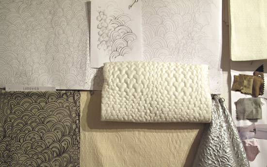
Part of the exhibit was a “mood wall” showing ideas, sketches, fabric samples and inspirations for a contemporary collection. I appreciate that they show original pencil drawings and a variety of renditions of a given motif all the way to the final fabric.


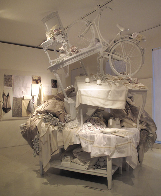
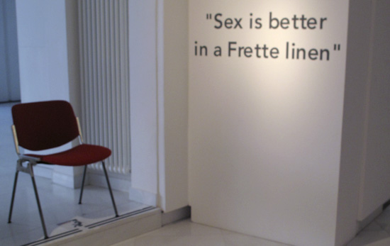
Another part of the show was an amusing, playful sculptural installation in an homage to Frette. I delighted in it as I walked into the room and circled.
